A before-and-after divider that follows a drag and springs to a click.
01Preview
braies-dawn.dng
Grade: Alpine morning · edited by Priya Nair
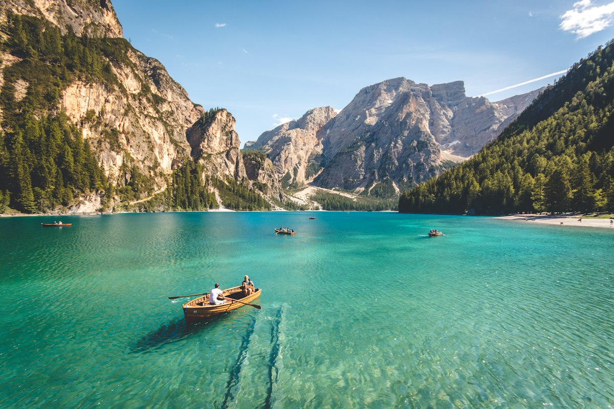

Graded
Drag the handle or click anywhere on the photo. Double-click the handle to recenter.
02Install
Copy the source into your project. It becomes yours: no package to update, no wrapper between you and the markup. It needs:
npm install motion @base-ui/react03Usage
import { ImageCompare } from "@/components/ui/image-compare";

<ImageCompare
  beforeLabel="Original"
  afterLabel="Graded"
  before={<img src="/edits/raw.jpg" alt="The lake as shot" />}
  after={<img src="/edits/graded.jpg" alt="The lake after grading" />}
/>04Source
"use client";
import { Slider } from "@base-ui/react/slider";
import { animate, motion, useMotionValue, useReducedMotion, useTransform, type AnimationPlaybackControls } from "motion/react";
import { useLayoutEffect, useRef } from "react";
import { cn } from "@/lib/cn";
import { spring } from "@/lib/motion";
import { useControllableState } from "@/lib/use-controllable-state";

type Reason = "input-change" | "track-press" | "drag" | "keyboard" | "none";

export type ImageCompareProps = Omit<React.ComponentProps<"div">, "children" | "defaultValue" | "onChange"> & {
  /** Usually an <img>; it's sized to cover the frame. Shown on the left (or top). */
  before: React.ReactNode;
  /** Shown on the right (or bottom). Must share the framing of `before`. */
  after: React.ReactNode;
  beforeLabel?: string;
  afterLabel?: string;
  /** Where the divider sits, 0–100, from the left (or top). */
  value?: number;
  defaultValue?: number;
  onValueChange?: (value: number) => void;
  orientation?: "horizontal" | "vertical";
  /** Shape of the frame. Pass null to size it with className instead. */
  aspectRatio?: number | string | null;
  disabled?: boolean;
  /** Accessible name of the divider. */
  label?: string;
};

export function ImageCompare({
  before,
  after,
  beforeLabel = "Before",
  afterLabel = "After",
  value: valueProp,
  defaultValue = 50,
  onValueChange,
  orientation = "horizontal",
  aspectRatio = "3 / 2",
  disabled = false,
  label = "Divider position",
  className,
  style,
  ...rest
}: ImageCompareProps) {
  const [value, setValue] = useControllableState({ value: valueProp, defaultValue, onChange: onValueChange });
  const reduce = !!useReducedMotion();
  const vertical = orientation === "vertical";
  // The divider's drawn position. It follows a drag 1:1 and springs to a click, so a press
  // anywhere on the image reads as the divider travelling there rather than teleporting.
  const pos = useMotionValue(value);
  const reason = useRef<Reason | null>(null);
  const running = useRef<AnimationPlaybackControls | null>(null);
  const knob = useRef<HTMLSpanElement>(null);

  useLayoutEffect(() => {
    running.current?.stop();
    const why = reason.current;
    reason.current = null;
    if (reduce || why === "drag" || why === "keyboard" || why === "input-change") pos.set(value);
    else running.current = animate(pos, value, spring.snappy);
  }, [value, pos, reduce]);

  const beforeClip = useTransform(pos, (p) => (vertical ? `inset(0 0 ${100 - p}% 0)` : `inset(0 ${100 - p}% 0 0)`));
  const afterClip = useTransform(pos, (p) => (vertical ? `inset(${p}% 0 0 0)` : `inset(0 0 0 ${p}%)`));
  const at = useTransform(pos, (p) => `${p}%`);

  // Base UI measures vertical sliders from the bottom; the divider is measured from the top.
  const toSlider = (v: number) => (vertical ? 100 - v : v);

  return (
    <Slider.Root
      value={toSlider(value)}
      onValueChange={(v, details) => {
        reason.current = details.reason;
        setValue(toSlider(v as number));
      }}
      orientation={orientation}
      disabled={disabled}
      min={0}
      max={100}
      step={1}
      largeStep={10}
      className={cn("group/compare relative isolate select-none overflow-hidden rounded-xl bg-hover", className)}
      style={{ aspectRatio: aspectRatio ?? undefined, ...style }}
      onDragStart={(e) => e.preventDefault()}
      {...rest}
    >
      <Slider.Control
        onDoubleClick={(e) => {
          // Double-clicking the handle puts it back in the middle. The slider captures the pointer,
          // so the event lands on the control: hit-test the handle by position instead.
          const r = knob.current?.getBoundingClientRect();
          if (r && e.clientX >= r.left - 6 && e.clientX <= r.right + 6 && e.clientY >= r.top - 6 && e.clientY <= r.bottom + 6) {
            reason.current = null;
            setValue(50);
          }
        }}
        className={cn(
          "absolute inset-0",
          vertical ? "cursor-row-resize touch-pan-x" : "cursor-col-resize touch-pan-y",
          "data-disabled:cursor-default",
        )}
      >
        <Layer>{after}</Layer>
        <motion.div className="absolute inset-0" style={{ clipPath: beforeClip }}>
          <Layer>{before}</Layer>
          {/* Each label belongs to its image, so the divider cuts through it rather than it floating on top. */}
          <Tag className="left-3 top-3">{beforeLabel}</Tag>
        </motion.div>
        <motion.div className="pointer-events-none absolute inset-0" style={{ clipPath: afterClip }}>
          <Tag className={vertical ? "bottom-3 left-3" : "right-3 top-3"}>{afterLabel}</Tag>
        </motion.div>

        <motion.div
          aria-hidden
          className={cn(
            "pointer-events-none absolute flex items-center justify-center",
            vertical ? "inset-x-0 h-0 -translate-y-1/2" : "inset-y-0 w-0 -translate-x-1/2",
          )}
          style={vertical ? { top: at } : { left: at }}
        >
          {/* The line: near-white in both themes, with a hairline so it holds on bright photos too. */}
          <span className={cn("absolute bg-raised shadow-[var(--shadow)] ring-1 ring-fg/15 dark:bg-fg dark:ring-frame/40", vertical ? "inset-x-0 h-0.5" : "inset-y-0 w-0.5")} />
          <span
            ref={knob}
            className={cn(
              "pointer-events-auto relative grid size-9 shrink-0 place-items-center rounded-full border border-line-2 bg-raised text-fg shadow-pop dark:border-transparent dark:bg-fg dark:text-frame",
              "transition-[scale,outline-color] duration-150 ease-out-expo",
              // A squash on press, held while dragging; it lets go the moment you do.
              "group-active/compare:scale-[0.92] group-data-dragging/compare:scale-[0.92] motion-reduce:scale-100!",
              "outline-1 outline-offset-2 outline-transparent group-has-[input:focus-visible]/compare:outline-solid group-has-[input:focus-visible]/compare:outline-fg-3",
              "before:absolute before:-inset-1.5 before:rounded-full before:content-['']",
              "group-data-disabled/compare:opacity-60",
            )}
          >
            <Arrows vertical={vertical} />
          </span>
        </motion.div>

        <Slider.Track className="absolute inset-0">
          <Slider.Thumb
            aria-label={label}
            getAriaValueText={(_, v) => {
              const shown = Math.round(vertical ? 100 - v : v);
              return `${shown}% ${beforeLabel.toLowerCase()}, ${100 - shown}% ${afterLabel.toLowerCase()}`;
            }}
            className="pointer-events-none size-px opacity-0"
          />
        </Slider.Track>
      </Slider.Control>
    </Slider.Root>
  );
}

function Layer({ children }: { children: React.ReactNode }) {
  return (
    <div className="pointer-events-none absolute inset-0 *:absolute *:inset-0 *:size-full *:object-cover *:select-none [&_img]:[-webkit-user-drag:none]">
      {children}
    </div>
  );
}

function Tag({ className, children }: { className?: string; children: React.ReactNode }) {
  return (
    <span
      className={cn(
        "pointer-events-none absolute flex h-6 items-center rounded-full bg-page/75 px-2.5 text-[11.5px] font-medium text-fg backdrop-blur-sm",
        className,
      )}
    >
      {children}
    </span>
  );
}

// Two chevrons that part while you drag, like the handle is being pulled open.
function Arrows({ vertical }: { vertical: boolean }) {
  const part = "transition-transform duration-200 ease-out-expo motion-reduce:transition-none";
  return (
    <svg width="18" height="18" viewBox="0 0 18 18" fill="none" stroke="currentColor" strokeWidth={1.5} strokeLinecap="round" strokeLinejoin="round" className={vertical ? "rotate-90" : undefined}>
      <path d="M6.5 5.5 3 9l3.5 3.5" className={cn(part, "group-hover/compare:-translate-x-px group-data-dragging/compare:-translate-x-[2px]")} />
      <path d="M11.5 5.5 15 9l-3.5 3.5" className={cn(part, "group-hover/compare:translate-x-px group-data-dragging/compare:translate-x-[2px]")} />
    </svg>
  );
}05Props
| Prop | Type | Default | Description |
|---|---|---|---|
| before* | ReactNode | — | Usually an img; it's sized to cover the frame. Left, or top when vertical. |
| after* | ReactNode | — | The other image, with the same framing. Right, or bottom. |
| beforeLabel / afterLabel | string | "Before" / "After" | Corner labels. Each is clipped with its own image, so the divider cuts through it. |
| value / defaultValue | number | 50 | Where the divider sits, 0–100 from the left (or top). Controlled or uncontrolled. |
| onValueChange | (value: number) => void | — | Called as the divider moves. |
| orientation | "horizontal" | "vertical" | "horizontal" | Side by side, or top and bottom. |
| aspectRatio | number | string | null | "3 / 2" | Shape of the frame. Pass null to size it with className. |
| disabled | boolean | false | Locks the divider where it is. |
| label | string | "Divider position" | Accessible name of the divider. |
06Notes
Behavior
- Press anywhere on the photo and the divider travels there; keep holding and it follows the pointer 1:1. Double-click the handle to put it back in the middle.
- Touch keeps the page scrollable in the other axis (pan-y when side by side, pan-x when stacked), so the compare never traps a phone scroll.
- Images are laid out to cover the frame and can't be dragged out as ghosts; the frame keeps its shape before they load.
Motion
- A click springs the divider on the snappy spring (520/38); a drag and the arrow keys move it directly, with no easing between pointer and line.
- The handle squashes to 0.92 while pressed and its chevrons part by 2px while dragging, so the grip visibly takes hold. Reduced motion drops the squash, the parting and the spring.
Accessibility
- Built on the Base UI slider: a real range input with arrow keys (1%), Shift or Page keys (10%), Home and End.
- The value is read as “42% original, 58% graded” using your labels, and the handle shows a focus ring when reached by keyboard.